
The Empirical Evidence for Technical Analysis
and and how to use it.

There aren’t many fields that created more gurus, courses, and paid groups than technical analysis. Drawing magical lines on a chart to predict future price moves sounds intriguing, but is there actually an edge in it, or is it just astrology for unemployed people who own multiple monitors? The slightly annoying answer is that there is a little bit of truth on both sides, and the gap between them is mostly about understanding why it works.
Over the years I have spoken with quants who laugh at technical analysis, and with people who made millions off simple price charts and indicators. This guide is my attempt to give you the whole picture. Why technical analysis works, which parts hold up under real research, which parts are old ideas renamed and sold back to you, and how to actually use any of it without burying yourself under forty indicators.
If you like this article, read the rest of the blog, those of you interested learning more about data based approach to trading, visit tradingriot.com.
The Efficient Market Hypothesis
The efficient market hypothesis, laid out by Eugene Fama in 1970, says that prices already reflect all available information. New information gets priced in almost instantly, so at any given moment the price is a fair estimate of value and the next move is essentially random. It comes in three flavours. The weak form says prices already reflect all past price and volume data. The semi-strong form says they reflect all public information. The strong form says they reflect everything, including private information.

The weak form is the one that should worry you, because it aims straight at technical analysis. If markets are weak-form efficient, then everything sitting in a price chart is already baked into the current price, and no amount of staring at old prices can give you an edge. Under that version of the world, drawing lines is genuinely useless.
On top of that, markets are one of the most competitive arenas on the planet, and that only makes EMH harder to argue with. The money on the other side of your trade is rarely some confused retiree. A lot of it is firms staffed by PhDs from the best schools in the world, running models on hardware you cannot afford, paying for data you will never see, and fighting each other for fractions of a cent. That arms race gets fiercer every year. So the idea that a hand-drawn trendline is your durable edge against all of that is, frankly, borderline silly.
So is it all pointless? Most people do not beat the market as we see in many published statements from brokerage firms. Most edges are tiny, crowded, and gone the moment they get popular. Most of the time price really does sit close to fair value, and most retail traders lose. Anyone who waves EMH away as academic nonsense is usually about to sell you something, so treat it as your default.
I would say that EMH is mostly right, but not completely right. The biggest crack with the theory is the assumption that participants are rational and that information spreads instantly. Real people are neither. They anchor, they herd, they overreact and then underreact, and that behaviour leaves footprints, which is exactly why anomalies like momentum keep showing up in the data decades after everyone supposedly knew about them. One of the simplest forms of making money in markets which also beats the EMH assumptions is harvesting different risk premiums, for which you need little to no technical analysis, I wrote article about that here.
Start with the maths, because the simplest efficient-market and random-walk models assume returns are roughly normally distributed, the familiar bell curve, and they are not. Real markets have fat tails, meaning extreme moves happen far more often than a normal distribution says they should. In statistical terms the return distribution is leptokurtic, it carries excess kurtosis, which is a fancy way of saying the tails are fatter and far more of the action lives out in them than a bell curve allows. Markets are mostly efficient, real edges are small and you had better have a concrete reason for why one exists, and the exploitable cracks tend to sit around volatility and the tails, where the market misprices how violent things can get.
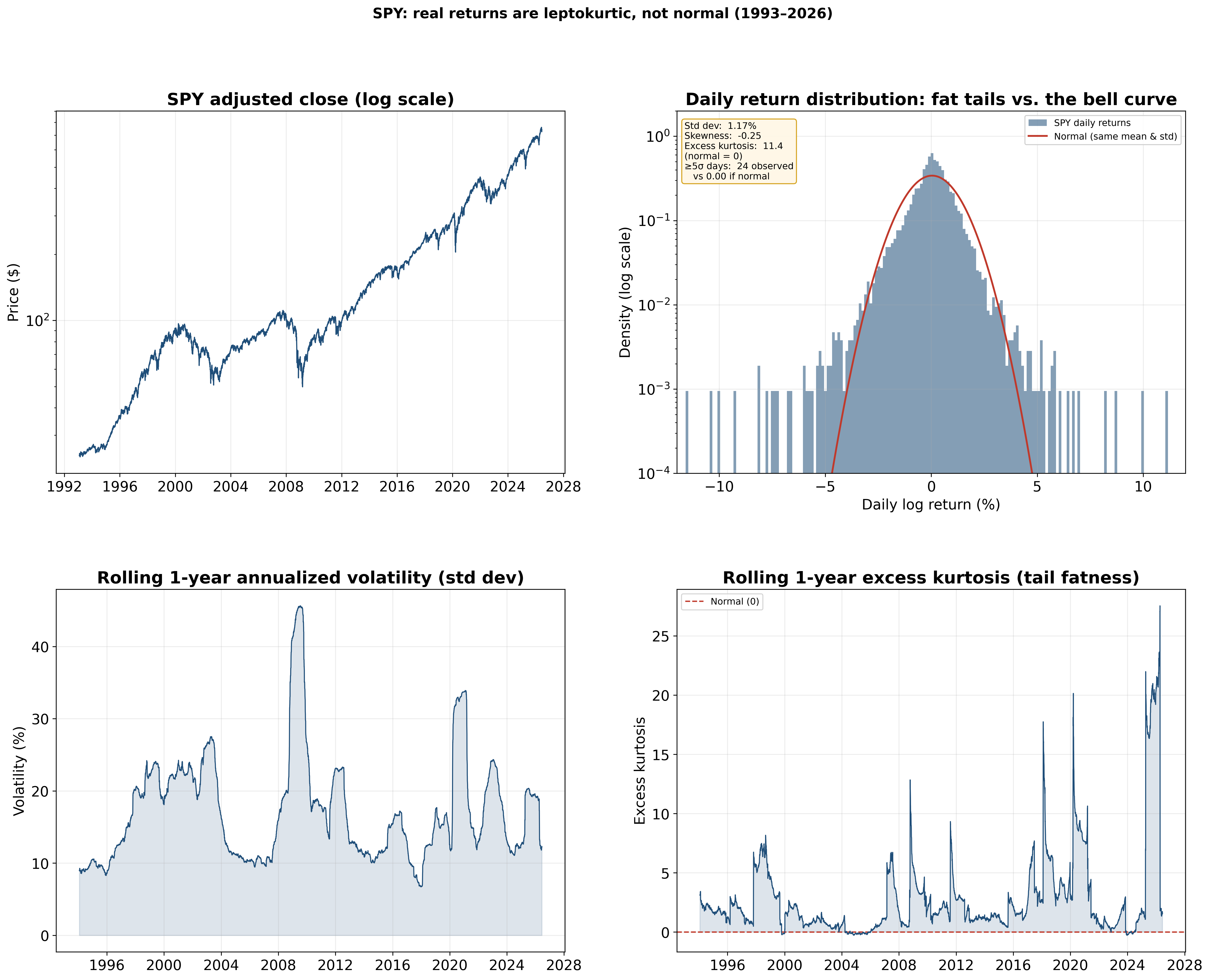
The 1987 crash, 2008, the COVID collapse, these are not once-in-the-history-of-the-universe events the way a bell curve prices them, and they keep happening. These events happen in all asset classes no matter if you trade equities, traditional or crypto futures.
Then there are the crowds. When GameStop and AMC ripped hundreds of percent in early 2021, that was not new information about the businesses. It was a herd, coordinated positioning, and a pile of trapped shorts pushing price miles away from anything resembling fair value. Efficient markets are not supposed to do that. Novelty cracks it open too. When an asset is genuinely new, there is no agreed fair value to snap back to, so the price can trend for a long time while the market gropes toward one. Crypto did this for years with Bitcoin few years ago or Hyperliquid in more recent history, the AI repricing in equities ran for many months as a brand new story slowly spread through the market, and the commodity and energy moves of 2022 trended hard on supply shocks very few models predicted. In every one of those, price was discovering value out in the open, and in situations like these technical analysis can be actually useful.
So the right mental picture is not “markets are perfectly efficient, give up,” and it is not “the chart is a cheat code.” or my favorite cringe saying “show me the price and I will tell you the news.” It is that markets are mostly efficient, with small, shifting inefficiencies created by human behaviour and by risk that gets mispriced, especially at the extremes. That narrow, moving space is the only place a technical edge can actually live. Everything that follows is about finding it without fooling yourself in the process.
What is technical analysis
Technical analysis is the study of price itself. Instead of digging into a company’s earnings or a currency’s interest rate, you look at what the price has already done, the chart and the volume behind it, and you try to read what is likely to come next. Fundamental analysis asks what something is worth. Technical analysis asks what the price is doing and where it is likely to go next.
The whole thing rests on a few old assumptions. That price already reflects most of what is known about an asset. That markets move in trends rather than pure randomness. And that the behaviour behind those moves tends to repeat, because people keep reacting to fear and greed the same way they always have.
None of this is new, and that is worth remembering before anyone sells you their “revolutionary” system. Traders in 18th century Japan were already reading candlestick charts on the Dojima rice exchange, and Munehisa Homma is usually credited with the idea that price action reflected the emotions of the market, not just the supply of rice. In the late 1800s Charles Dow laid down what became Dow Theory, the foundation most trend analysis still leans on. Edwards and Magee turned charting into a proper discipline with their 1948 book, Welles Wilder handed everyone the indicator toolkit in the 1970s with things like the RSI, and then computers showed up and let people backtest all of it instead of arguing about it. Today most of the heavy lifting is done by systematic funds and algorithms running these same ideas at a speed no human can match.
Technical analysis works, but not for the reasons most gurus sell you. The edge comes from boring, measurable mechanics. Big orders get split up and fed into the market slowly. Crowds and CTAs (trend-following funds) pile into the same signals. Watched levels become self-fulfilling because everyone is watching them. Orders cluster at obvious prices.
Most of what works is simple, and the simple stuff is the stuff with actual studies behind it. The fancy stuff is mostly repackaging. And the biggest mistake I see, is traders treating the chart as the whole edge when it is really one layer sitting on top of positioning, narratives, and fundamentals.
Does drawing lines on a chart actually make money?
Yes, and we have decades of academic work saying so, not just screenshots from Discord paid groups.
In 2007 Park and Irwin did review in the Journal of Economic Surveys, which went through the entire body of empirical work on technical trading. What they found is that technical rules consistently produced economic profits in foreign exchange and futures markets, while the evidence in stocks was weaker. The edge was clearest before the early 1990s and faded after that, as markets got more efficient and people started accounting properly for costs and data mining.
So similar as with lot of things in financial markets, the edge was real, and the edge shrank.
Brock, Lakonishok and LeBaron tested two of the simplest rules going, a moving average rule and a trading-range breakout, on the Dow from 1897 to 1986, and they used bootstrap methods to check the results against random-walk and GARCH-type models. The rules held up. Buy signals produced higher returns than sell signals, and the returns after buy signals were less volatile on top of that. For a long time this was the single strongest piece of evidence that simple technical rules actually carried information.
Lo, Mamaysky and Wang did something I like even more. They took the classic chart patterns, automated them so a human could not fudge the call, and ran them statistically. Even head and shoulders, the pattern the sceptics love to laugh at, carried some information. Not a money printer, but some signal.
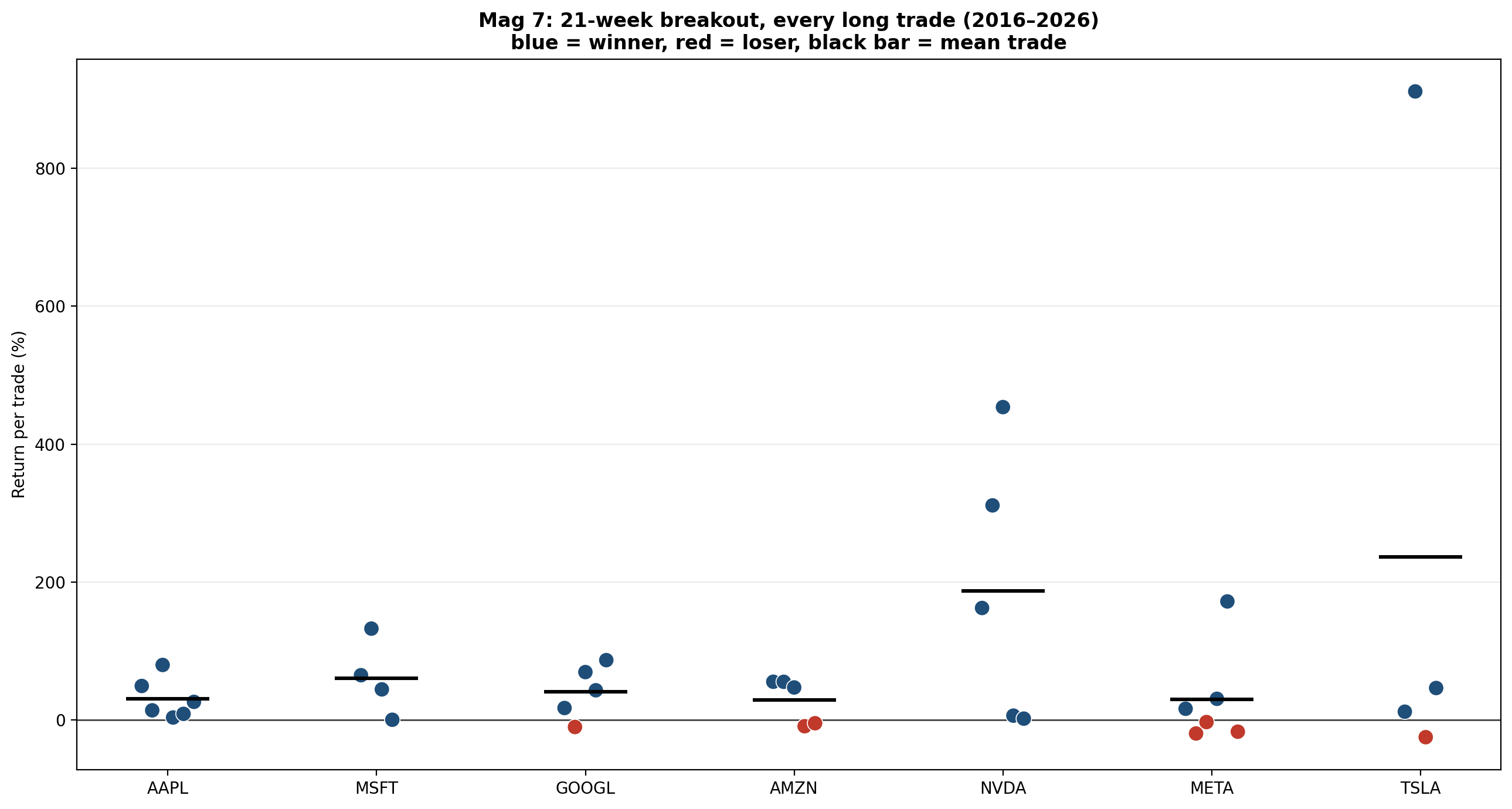
You do not need to wade through a research paper to get a feel for this. The chart below is a simple long-only moving average crossover system run on the daily SPY, the main S&P 500 ETF.
A moving average is the most popular trend indicator there is, and the idea behind it is simple. You take the average closing price over the last so many days, say the last 50 or the last 200, and you plot that as a line. Every new day the window slides forward and drops the oldest price, so the line keeps moving, which is where the name comes from. It smooths out the day-to-day noise and gives you a cleaner read on which way price is leaning. A crossover system just uses two of them, a faster one and a slower one, and the rule is about as basic as it gets. When the fast average crosses above the slow one you go long, and when it crosses back below you step aside.
The strategy made money over the last decade, no argument there. But look at the yellow line, because that is just buying SPY and holding it, doing absolutely nothing. By doing nothing you would have ended up with more money.
SPY has a strong positive drift, it grinds higher over the years, and almost any rule that keeps you long an asset that mostly goes up is going to look clever. Run the exact same system on something that has gone nowhere for a decade, treasury bond futures for example, and the results fall apart.
Why it works
This is usually the part where you meet your twenty year old guru driving rented supercar and flexing money on social media willing to teach you about “smart money”, “manipulation” and “the banks that are hunting your stops.” It sells well, but its lot of nonsense. The real reasons are duller and far more useful, there are four worth knowing.
Big orders get split up
Order flow is persistent. Buys tend to follow buys and sells tend to follow sells, and this runs out to thousands of orders, which in real time means days.
Tóth, Palit, Lillo and Farmer dug into why, using London Stock Exchange data in a paper called “Why Is Equity Order Flow So Persistent?” They weighed two explanations. The first was herding, lots of separate traders doing the same thing at once. The second was order splitting, a single large player chopping one big order into many small slices and feeding them in over time. This is actually great paper worth reading.
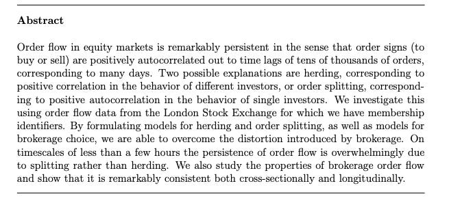
At short timeframes, under a few hours, the persistence is overwhelmingly order splitting, not herding. A fund cannot dump its whole position at once without moving the price against itself and getting front-run, so it parcels the order out over hours or days and leans on the same side again and again. This goes all the way back to Kyle’s 1985 work on how an informed trader trades gradually to hide and reduce impact. This is the core idea of supply and demand trading strategy that will be covered later in the article.
The TLDR here is that the big players stacks orders in an area because they cannot fill in one go. These levels often provide reaction when price revisits them as large volume accumulated in the areas, there are lot of supporting concepts about it in Auction Market Theory as well.
Herding
This is the engine under momentum, which is about the most stubborn anomaly in all of finance and the one which I think will persist into the future. Jegadeesh and Titman showed back in 1993 that buying recent winners and selling recent losers paid off over three to twelve month horizons. Then Moskowitz, Ooi and Pedersen ran “Time Series Momentum” across 58 futures contracts spanning equities, currencies, commodities and bonds, over more than 25 years. A 12-month trend signal predicted future returns, and it worked for every single instrument they tested. They also found that speculators ride the trend while hedgers take the other side, which is worth filing away for the positioning section later.
So when you trade a trend, you are betting that a crowd that is already moving keeps moving for a while, because that is what the data says crowds do.
While some of these research papers are old now and the effects again are weaker, they still work in all asset classes.
Watched levels defend themselves
Some levels work simply because enough people are staring at them.
If half the desks in the world are watching the same prior swing high, the same round number, the same daily level, then orders pile up there and the level holds because the belief in it created the orders. It is a feedback loop, and it is strongest at the obvious, widely watched prices.
This is also why higher timeframe levels get more respect than lower ones. More eyes, more liquidity, more orders. A five-minute level that a handful of scalpers care about gets run over within hours. A weekly level sits on every serious chart on the planet.
Orders cluster at predictable prices
Orders are not scattered at random. They pool. Above prior highs and below prior lows, around round numbers, at session extremes, at prices the financial media keep repeating.
Many studies found that stop and take-profit orders exist around round numbers, and that this clustering helps explain why support, resistance and trend reversals work as well as they do. This is the mechanism behind every liquidity course. The marketing wraps it in mystery, but the reality is mundane. You can reason about where other people’s orders probably sit, because humans place them in boringly predictable spots that often leads to false breakouts or liquidation cascades.
A cohort of algorithms is executing at the same levels
A huge amount of money now trades on rules in systematic manner. Managed futures funds, CTAs and quant shops run systematic strategies, and a lot of those strategies key off the same handful of public signals. Breaks of a major moving average. New 21-week highs and lows. New 52-week highs and lows. Prior-day and prior-week extremes.
When price breaks a widely used moving average or prints a fresh 21-week high, a whole cohort of these systems generates a signal at roughly the same price, and their execution clusters in the same window. That clustered flow is part of what makes the move keep going. It is herding again, except the herd is made of models that were all fed similar rules.
These signals work and lot of systematic money trades them, and that orders cluster at salient prices. The “armies of bots defending the 200-day” framing is a reasonable read of those facts. Treat it as a strong hypothesis that fits the evidence and you will not get caught out.
If you would rather see this for yourself than take my word for it, the cleanest way is to backtest the simple version. A 50-day over 200-day moving average cross. A 52-week high breakout held for a fixed period. A 20-day breakout in the style of the old Turtle traders.
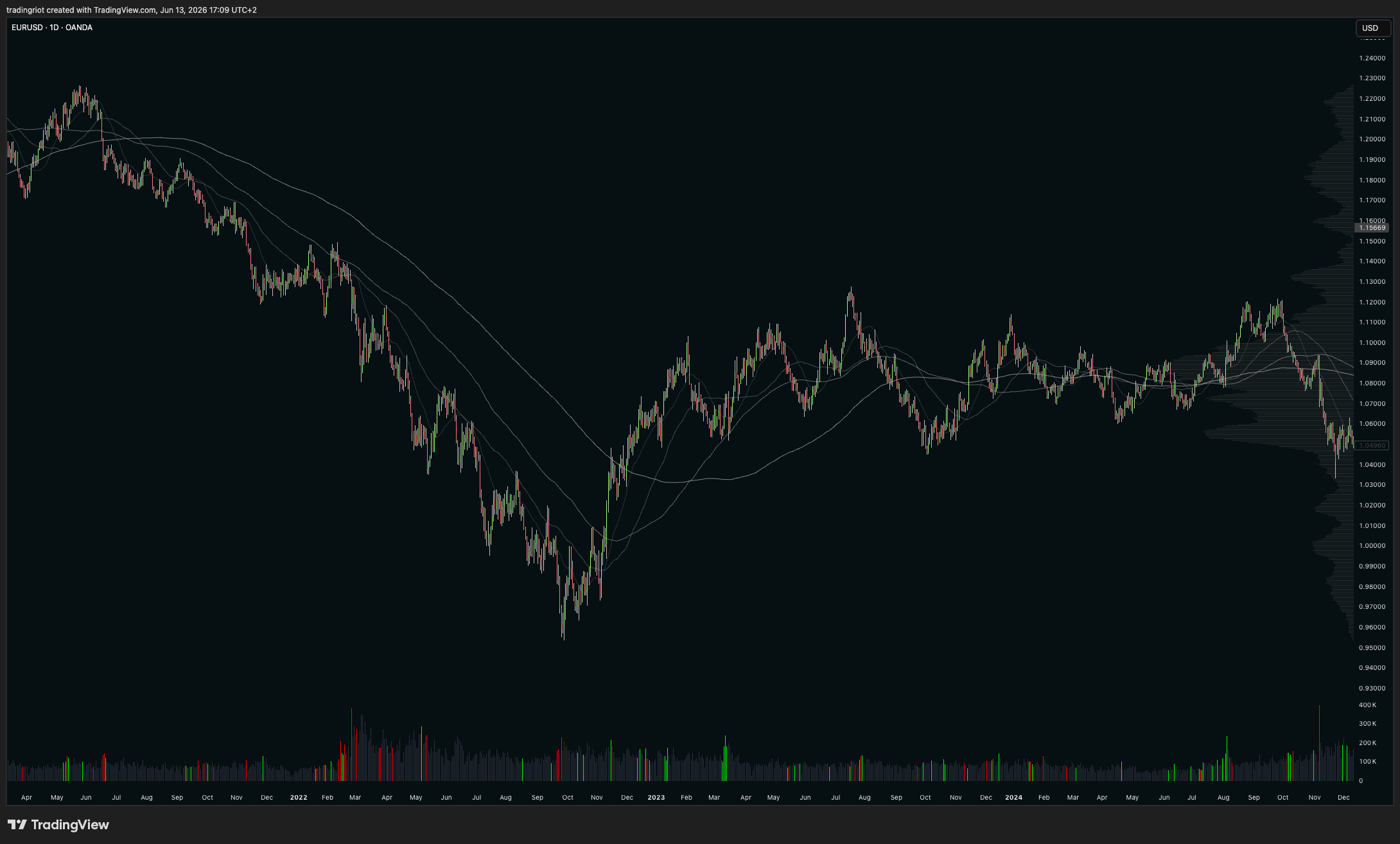
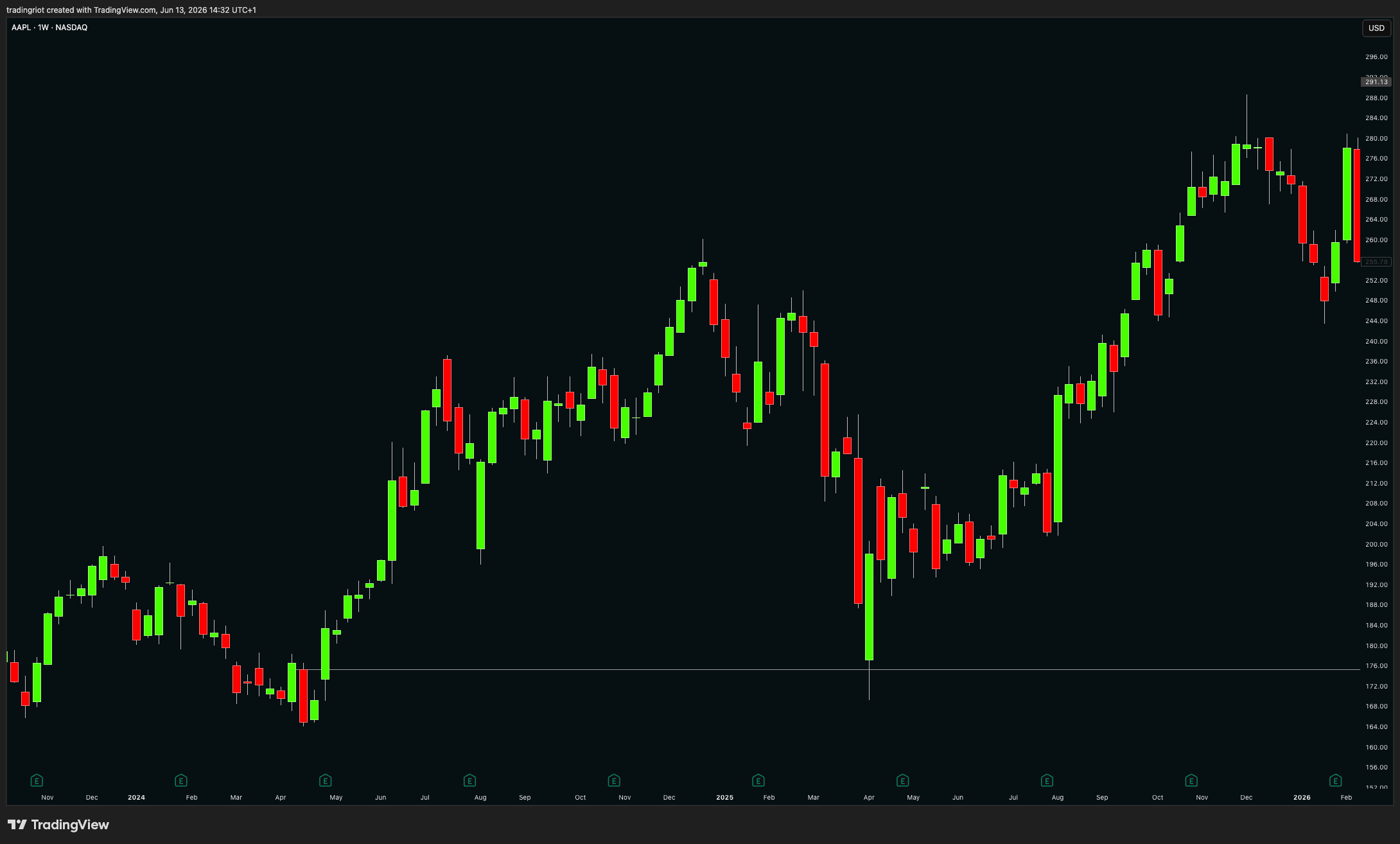
Again this is no magic here, these levels sometimes work, sometimes do not. EURUSD chart above shows how well were moving averages respected in trending move during 2021-22 and were completely useless for two years after as price went sideways.
Where technical analysis lies to you
If I only gave you the good half I would be no better than the people I spend half this article criticizing, so here is the case against, and you should hold all of it in your head while you use the tools.
Data mining and confirmation biases are everywhere. I am sure you saw many courses showing price action concepts or indicators providing perfect examples, but in reality these were chosen from large datasets just to make you believe the strategy. Test enough rules on enough history and some of them will look brilliant by pure luck. This is the main reason to be suspicious of a lot of the positive results. A strategy you found by trying ten thousand parameter sets on past data has usually found noise wearing a nice suit.
Subjectivity is a real problem too. Ask ten traders to draw support on the same chart and you will get ten slightly different lines. Body, wick, or close? This is the core weakness of classic support and resistance.
Edges decay. What worked in currencies in the 1980s worked a lot less well by the 2000s, because markets adapt and high-frequency firms eat slow edges for breakfast. Anything simple enough to fit in a course is simple enough to get crowded.
And costs quietly kill marginal strategies. Plenty of rules that win on paper lose once you subtract commissions, spread and slippage. A rule that is profitable before costs and unprofitable after them is not a strategy, it is a donation to your broker.
Indicators and market environments
An indicator is not a crystal ball. It is a tool, and like any tool it only works for the job it was built for. A moving average is built to keep you with a trend. An oscillator like the RSI is built to flag when a move is overstretched. Neither one is “right” or “wrong” in the abstract. They are right or wrong for the conditions in front of you, and the single biggest unforced error I see is traders running one setup in every condition as if the market were always the same animal.
Markets constantly change, they trend, and they range, and the skill that actually separates profitable traders from everyone else is not some secret indicator. It is recognising which one you are in and switching tools to match. A lot of this you already know if you have read my article on Auction Market Theory. Markets trend until they find acceptance, then they build accumulation or distribution, then they trend again. So your first job in any session is to figure out in what market conditions are you in.
In a trending environment, life is easier. Price prints clean structure, higher highs and higher lows on the way up, the mirror image on the way down. Use trend tools. A single moving average to define the side you are allowed to trade is plenty, and you really do not need three of them in different colors. The point of the indicator here is help you to stay in the trend and ideally trying not to play a hero by trying to catch exact tops or bottoms as trends often persist longer you can remain solvent by fading them.
In a mean-reverting, ranging environment, everything flips, and now you are fading the extremes. Bollinger Bands, oscillators like the RSI show you when a push is running out of fuel, I often just draw horizontal lines and look at relative volume to identify the climax buying/selling which often happens at tops and bottoms.
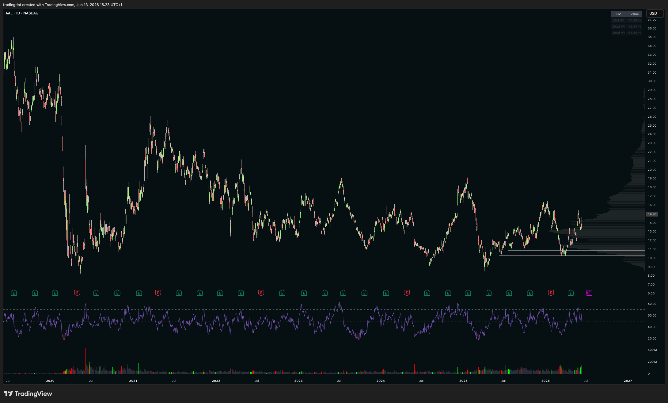
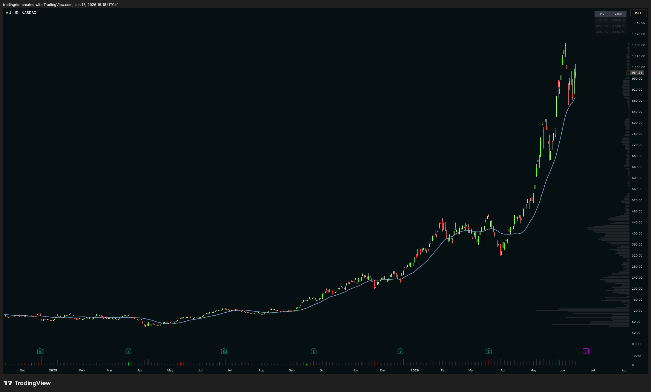
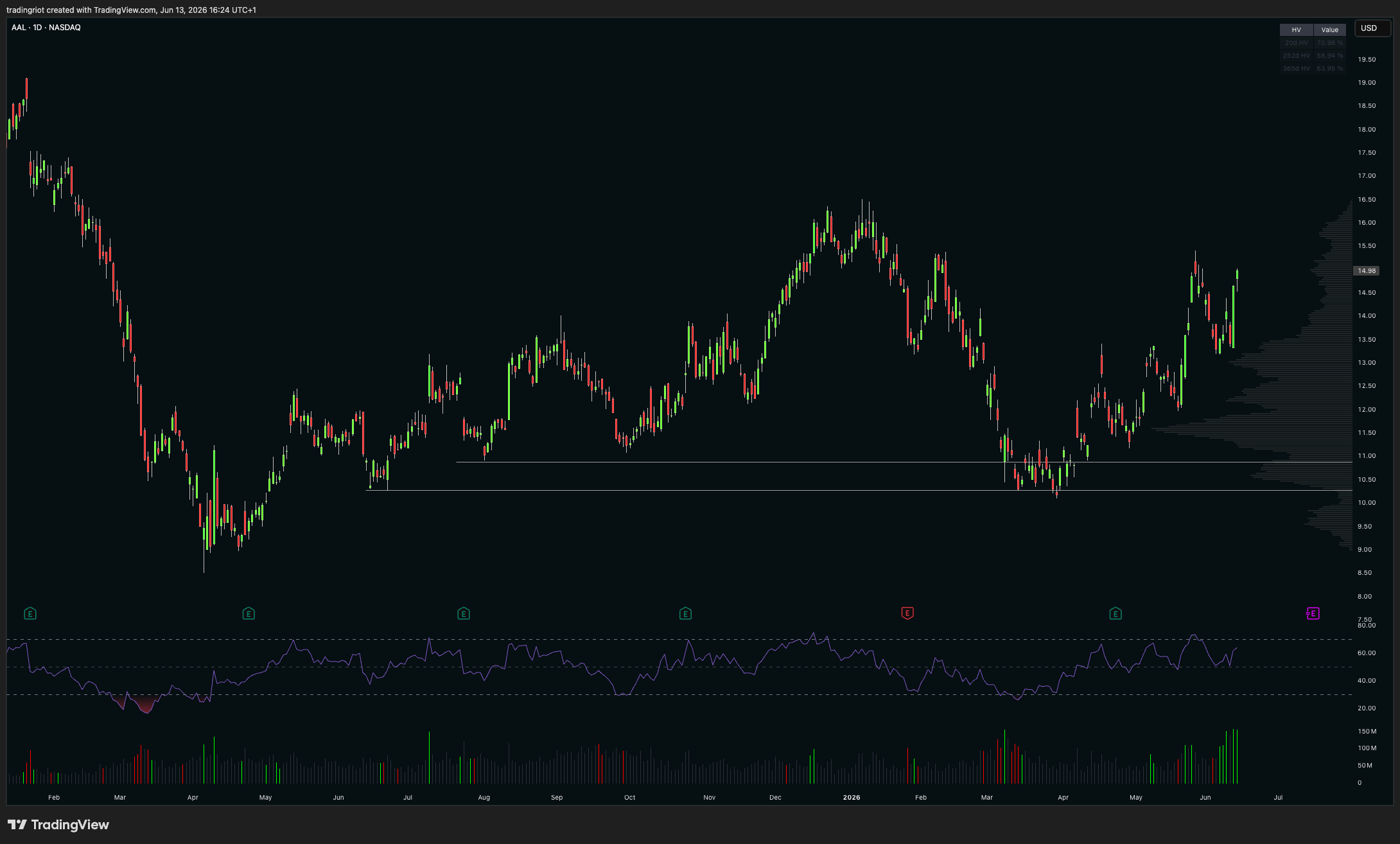
By looking at this chart of American Airlines, I hope you can recognise the difference between it and the chart of Micron above, because this one has clearly done nothing for the last six years. In a market like this, mean reversion is far more likely to work, which is exactly what happened earlier this year, when price hit prior support on increased volume and bounced higher. Look at the RSI and you will see how well it worked here too, and how buying and selling at the extremes would have been a profitable endeavour. Again, this is not the work of some magic indicator but of a trendless asset.
While you always read and hear everything about trending markets, truth is that you can get a long way with “in a range, lean against the extremes and respect the edges.” As markets are more often in range than trending. Most range breaks fail, and ranges reverse far more often than people expect, which is how traders get chopped to pieces buying the top of a range that was about to roll over.
Recognizing which environment you are actually in is the million-dollar question, and there is no indicator that answers it cleanly. Markets are non-stationary, they are forever evolving, and a regime only becomes obvious in hindsight. The best tell I have is structure. When a trend stops making new highs and lows and starts overlapping, momentum is drying up and a distribution may be forming. When a range stops respecting its edges and starts pushing with conviction, a trend may be starting. Watching for that shift costs you nothing, but it will never be a setting you flip on, there is this popular saying “strong opinions, loosely held” which I think should be your go-to motto in trading.
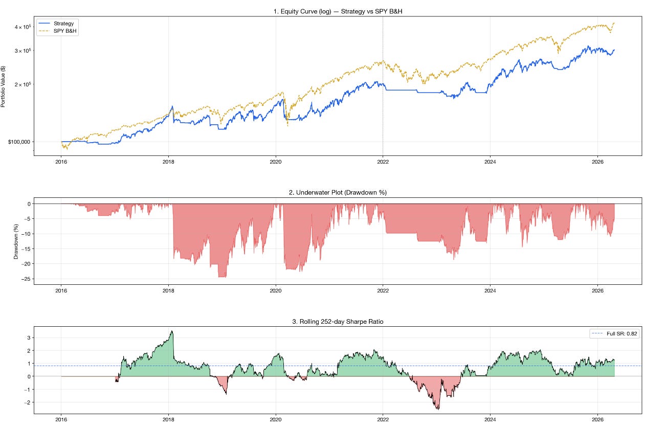
If you want proof that the regime matters more than the rule, look at one of my own backtests. This is a simple momentum strategy run across 47 CME futures markets, starting from a $500k account.
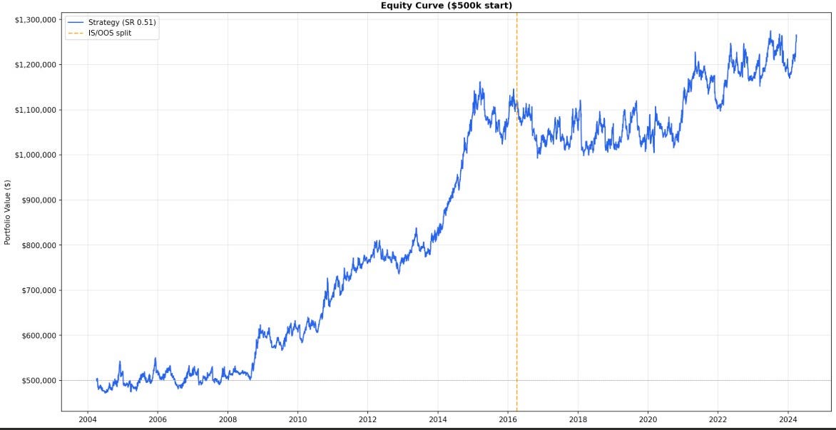
The shape tells the whole story. From the mid-2000s through about 2016 the curve climbs hard and reasonably cleanly, more than doubling the account. That period was a gift for momentum. Then look at what happens after the in-sample/out-of-sample line. The easy money is gone. The strategy spends years chopping sideways before finally grinding to new highs late in the sample, and a Sharpe of 0.51 over the full run is modest at best.
This is the “edges decay” point from earlier. Momentum is about the most robust, best-documented anomaly in finance, and even it worked extremely well in the past and far less well in recent years, because the environment that fed it changed. A simple rule did not stop being a simple rule. The market it was built for showed up less often. That is the entire argument for adapting to conditions rather than marrying one indicator, and it is why recognising the environment beats any single tool in your kit. Funnily enough this backtest ends at the end of 2024, if you traded last year you know we have had some huge moves across almost all futures markets therefore the equity curve would look great as the conditions for trend-following were great.
Price action concepts
Price action is even more popular than indicators these days, and you can build a complete approach out of a handful of price action ideas. I am going to take my time on these, because if you understand them properly you will not need to buy anyone’s course to trade them. They build on each other, so read them in order.
Price is fractal
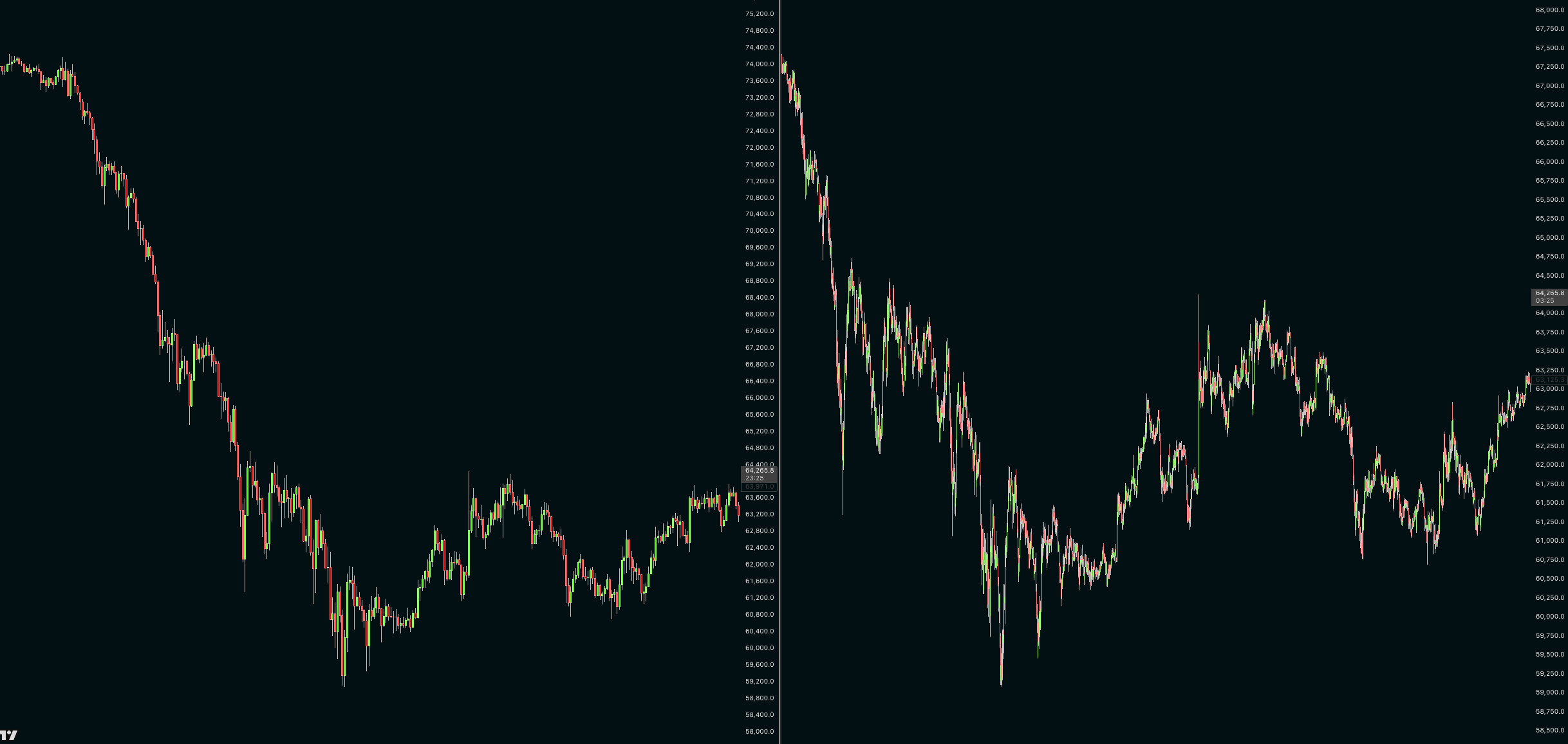
The same patterns show up on every timeframe. A market sells off, builds a base, fails to break lower and rallies, and that sequence looks structurally identical whether it played out over a few hours on a five-minute chart or over two years on the weekly. Hide the axis labels and the dates and I genuinely cannot tell you which one you are looking at. The way moves start, stall and end repeats at every scale, because the human and mechanical behaviour driving them is the same at every scale, below you can see two very similar charts, price went down then kinda grinded up slowly. As timeframes are not shown on the chart, you cant really tell which is which, but it is clear that they are very similar. On the left you have hourly timeframe over three month period, on right side you have five minute chart covering approximately week of trading.
This kills one of the most repeated lines in trading education, that the lower timeframes are “just noise.” They are the same thing, only faster. A monthly trend can be spotted forming on the weekly, the same way an hourly trend can be spotted forming on the five-minute. The only real difference is how many people are watching. A weekly level sits on every serious chart in the world, so it pulls in far more orders and attention than a five-minute level that a handful of scalpers care about and that goes stale within hours.
As I mentioned earlier, order splitting and order flow play a much bigger role on the small timeframes, which arguably makes intraday trading the more technical game. Tools like the depth of market, footprint charts and dealer gamma can genuinely add value there, and I may cover them in future articles.
I started out as a day trader and do not do it anymore, but there is no question it is the most popular category of trading, for real traders and course sellers alike, because the feedback loop is instant. I will probably make day trading a topic for another time. For now I would only caution you that it is brutally hard and the most competitive place to trade. On the higher timeframes you can get away with wider stops and still make money on the simple fact that some assets just drift higher over time, while intraday you are getting chewed up by high-frequency firms, costs, slippage and plenty of other things working against you.
Another thing which does not make much sense is putting magic importance on specific timeframes. The platforms hand you the daily, the 4 hour, the 1 hour, the 15 minute, and people treat those numbers as if the market cares about them. It does not. There is nothing special about a 4 hour candle versus a 3 hour candle. The same reversal that looks like nothing on one will look obvious on the other, purely because of where the candles happen to open and close. With high timeframes being slight exclusion here as again lot of algorithms and systematic trading strategies rely heavily on daily or weekly candle closes for example.
If you have no idea where to start, keep your high timeframe levels and ideas in mind, then drop down to a lower timeframe to time the entry. High timeframe for the idea, low timeframe for the trigger, or just stick with higher timeframes completely.
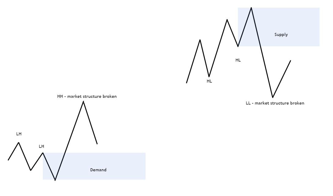
Market structure
Market structure is very simple concept to understand and while obviously not perfect, it works well enough to keep you in trends and recognizing reversals.
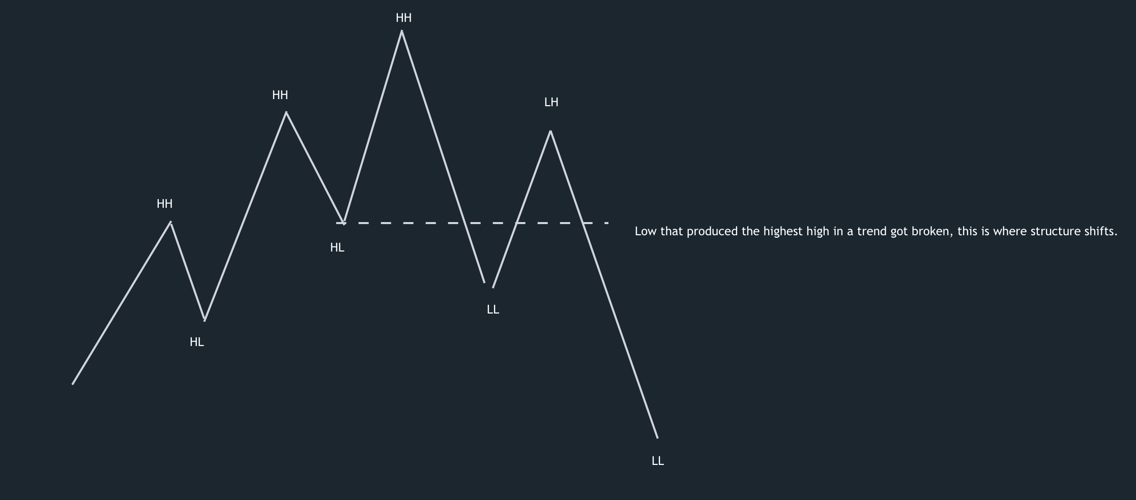
In an uptrend, price makes higher highs and higher lows. In a downtrend, lower highs and lower lows and you identify them by looking at swing points of candlesticks. That is the whole core of it. People have built entire frameworks on top of this, Dow Theory, Wyckoff, Elliott Wave, and they are all really describing the same thing in different vocabulary, so do not get lost in any single one. Markets trend until they reach a point where buyers and sellers roughly agree on price, they pause and build a range, and that range is either accumulation before another leg up or distribution before a leg down. Then the next trend begins, and the cycle repeats.
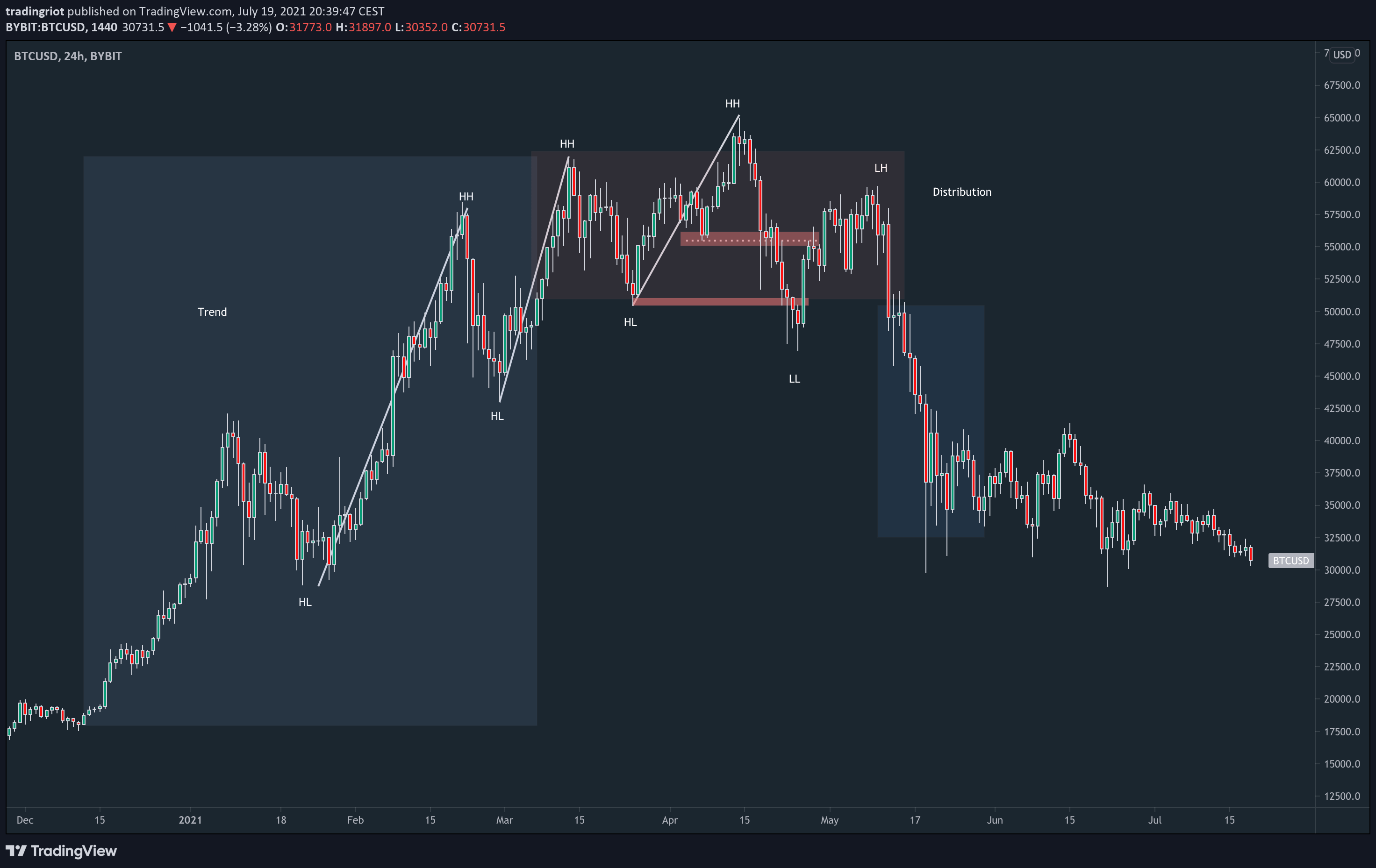
The signal you care about most is the break. While a trend is healthy it keeps printing those new highs and lows in sequence. When the sequence breaks, when an uptrend fails to make a new high and then takes out its prior low, structure has shifted, and that shift is your earliest and cheapest warning that the environment is changing. The strongest version of this comes after a long trend that rolls into a clear distribution at the highs and then loses structure. It happened at the 2021 Bitcoin top, it happened at the 2018 top, and it will happen again, because it is fractal and it repeats.
This is also where the classical chart patterns live. Head and shoulders, wedges, double tops, all the stuff that gets dismissed as retail nonsense. The patterns are not the problem. People just trade them with no regard for context. A head and shoulders forming as distribution at the top of an exhausted trend is a real signal. The exact same shape in the middle of a strong trend is noise. Put the pattern in the right structural place and it works, trade it blind and it does not.
Horizontal support and resistance
Price remembers levels, prior highs and lows act as floors and ceilings, and the reason is the order clustering we covered earlier, so a level is really just a price where a lot of resting orders happen to sit.
Support and resistance is subjective. Do you draw the line off the candle body, the wick, or the close? On the same chart you can justify two or three different resistance lines, and that wiggle room is where a lot of traders tie themselves in knots, panic out of good trades, and get faked out of bad ones.
You should obviously do whatever works for you. For me it is always marking the highs and lows of the wicks, because that is where most stops get triggered. It is worth mentioning, though, that a lot of algorithmic strategies do not use OHLC data at all, only the closing price, so for them the open or close can be the more relevant level. When I plan to fade one of these levels, I always allow for price to probe beyond the extreme first. A couple of other rules are worth following too. When support breaks it will very likely turn into resistance, and vice versa. And the more touches a level has, the weaker it gets, because any residual orders holding price back get consumed on each successive attempt.
Diagonal support and resistance
Trend lines and channels are the diagonal cousins of horizontal levels, and they work for the same self-fulfilling reason although you can channel your inner-artist even more when drawing these. Enough people draw the same line that orders gather along it. You can pivot a trendline off slightly different points and end up with completely different slopes, which means two traders can draw two convincing trend lines that flatly disagree.
They are fine for context. A clean channel is genuinely useful for reading the rhythm of a trend and seeing when price is stretched within it, but I would never take a trade just because price tagged a diagonal line. I recently took this short in Coffee futures, I wanted to short it for completely unrelated reasons to trend line, but I use the trend line for narrowing down the entry.
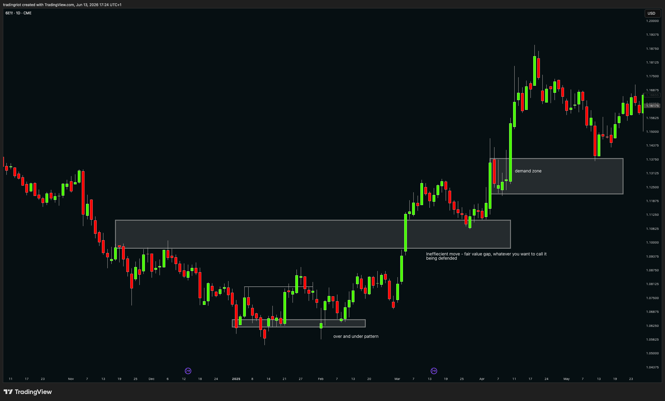
Supply and demand zones
Supply and demand zones are very popular and were repacked many times over the years, but I still do like to use them as they have some research backing them up and logical explanation for why they work.
A demand zone is the consolidation, the last down candle or small cluster of candles, right before a sharp move up. A supply zone is the consolidation right before a sharp move down. The logic is that the base is where large players quietly built a position and created an imbalance between buyers and sellers, and the sharp move out of it is that imbalance resolving. You mark demand below price and supply above price.
Two things make these zones work. The first is stacked orders, the order-splitting mechanic from the paper we walked through earlier. The player who created the impulse could not fill their whole size at once without blowing the price away from themselves, so part of that order is still resting back in the base, waiting. The second is trapped traders. Anyone who was positioned the wrong way before the impulse is now underwater, and when price comes back to the zone they bail out at break-even or a small loss, which adds fresh fuel in the direction of the original move.
Finding and marking a zone is mechanical once you know what you are looking for. Look at the chart and find a fast, decisive move in either direction. Then look to the left of it to find the base, the sideways bit right before the move took off. For a demand zone you mark the last down candle before a strong green candle leaves the area, from the top of the wick to the bottom of the wick. For a supply zone you mark the last up candle before a strong red candle leaves, again including the full wicks, not just the bodies. One rule keeps you honest. The move out of the base has to be strong enough to break structure. If price merely wandered off, there was no real imbalance and there is no real zone.
They are best to look for when they overlap with support and resistance zones, and again they are not everywhere, price does not have to reach any of these zones to move, but they can provide a great structure for trade entry.
Buying every demand zone and selling every supply zone on a bare candlestick chart is a mediocre strategy at best.
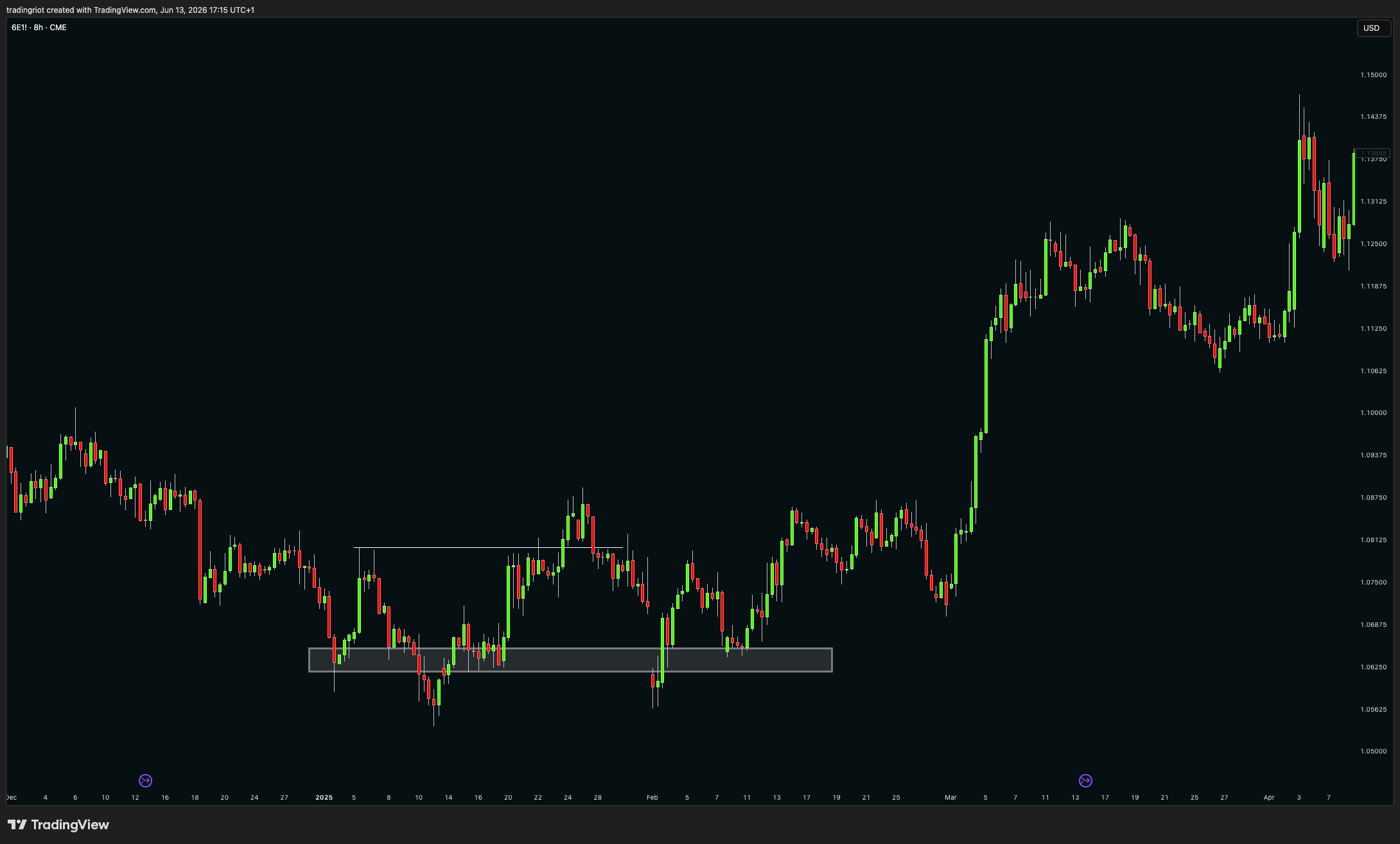
Over and under patterns
The last price action concept I actively look for when hunting entries is the over and under, sometimes called a quasimodo, and probably a dozen other names too. You can think of it as a version of support and resistance, or supply and demand if you like, and it is basically a confirmed false break above a prior level of support or resistance.
Price tries to break above a key level, often in a very sharp manner, but then fails back below it, and you can lean on your newly found knowledge of market structure to confirm the break of a prior swing point. After that you often get a retest of the original level before continuation.
While I would love to give you a clever, research-based explanation why price throws back to that original level of support or resistance, I genuinely do not know. I have just seen them so many times over the years that you will have to take my word for it.
Efficient and inefficient moves
Markets sometimes grind, slow and choppy, testing every level on the way, because the book is full and there are plenty of orders to trade against at each step. That is an efficient move. Other times price tears through an area fast, barely pausing, because liquidity there is thin and there is very little sitting in the way. That is an inefficient move.
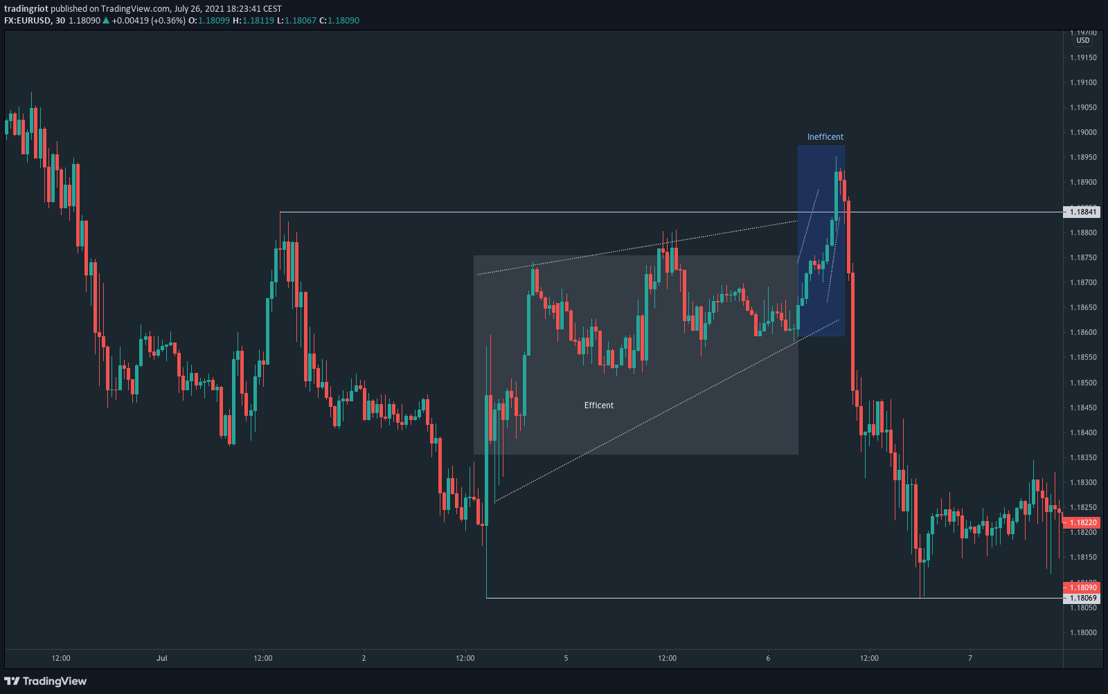
This matters for two reasons. A fast, inefficient move tends to leave a gap of skipped prices behind it, and the market often comes back later to trade through that gap, which is the same thing the ICT crowd rebranded as a fair value gap, and the same thing that shows up as single prints on a Market Profile. And the shape of a move tells you what is underneath it. When price grinds up efficiently and then collapses fast, the collapse often runs a long way, because the slow grind up never left much resting support beneath it to catch the fall. Reading whether you are in an efficient or an inefficient state stops you expecting a clean bounce in a spot where there is simply nothing there to bounce off.
When price turns inefficient and just runs like there is no tomorrow, that is often where the best opportunities show up. If it overshoots a key level and then starts to slow down, you are usually about to be met with a sharp reversal. On the other hand, when price can actually sustain the move, you will often find supply and demand zones sitting underneath it, and you can treat those large-bodied candles as zones in their own right. The buying, or selling, was so dominant and persistent through them that whoever was responsible is likely to defend those prices again.
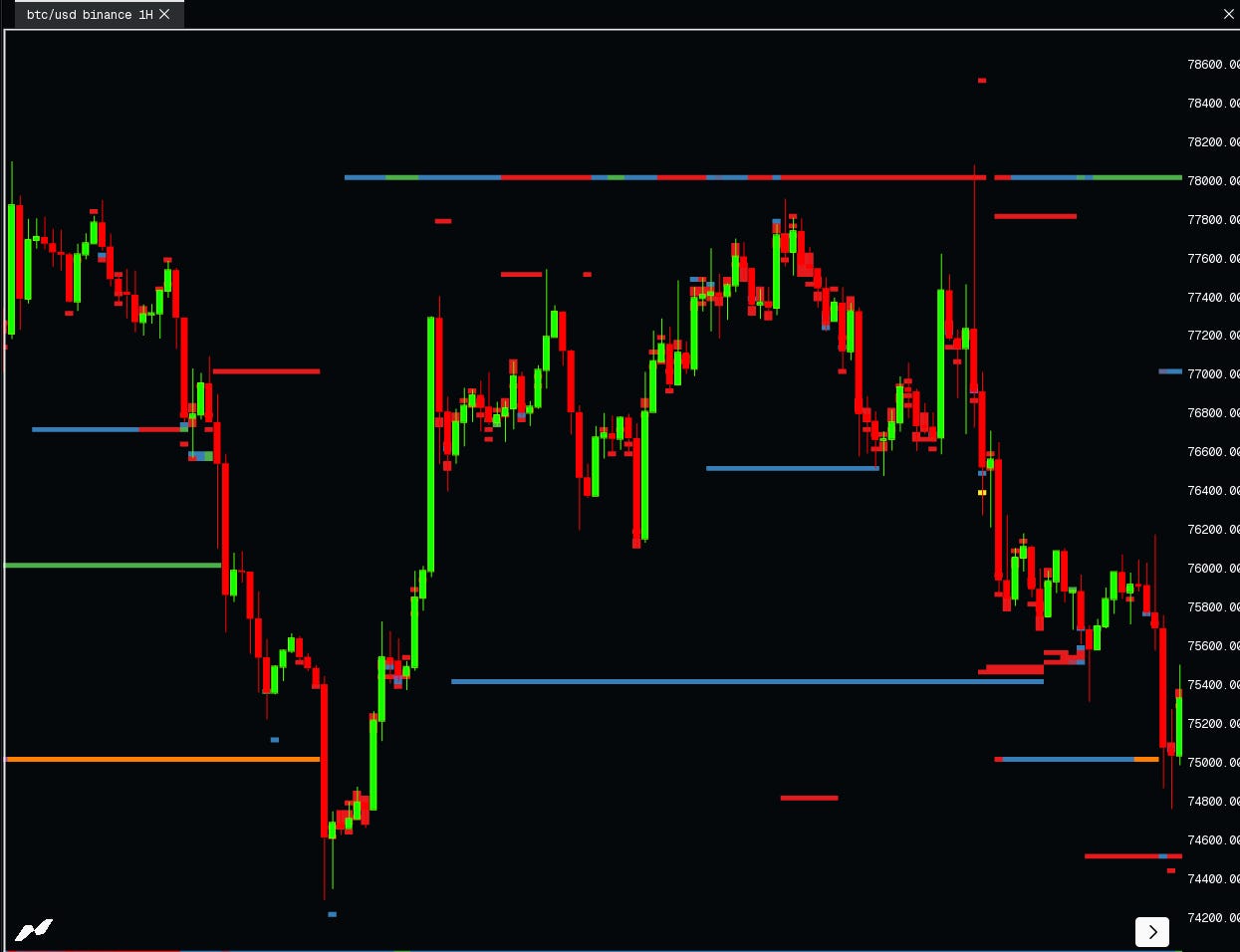
Fakeouts and liquidity
You have watched it a hundred times. Price breaks an obvious level, everyone piles in, and it instantly reverses. Manipulation? Mostly, no. And understanding why is one of the most useful things in this whole guide, because “liquidity” has become the single most abused buzzword in trading, marketed as a secret way to profit off retail traders. Most of the people throwing the word around could not actually tell you what it is.
Liquidity represents resting limit orders. It is the bids and offers sitting in the book, the floors and ceilings above and below price, the orders waiting to get filled. That is the whole of it. It is not stop losses. Stops and liquidations do not show up in the order book at all, because they execute as market orders. So when someone sells you a fancy indicator that supposedly plots where the stops are, understand that they are plotting an estimate, usually reverse-engineered from open interest, not a live feed of anything real.
There is a second trap in the order book itself. A lot of traders see a big resting order sitting under price and assume it is a whale building support. Ask yourself why anyone with real size would advertise their hand like that. More often than not those giant orders are spoofs, put there to fake demand or supply and pulled the moment price gets close. Genuine size usually gets worked quietly, traded over the counter or sliced into a stream of small orders, which is the same order splitting we keep coming back to, or presents itself as delta between bids and the offers rather than single order in the book.
Where liquidity genuinely pools is far more boring and far more useful. It clusters at prior day and prior week highs and lows, at key higher timeframe swing points, around round numbers, and at the price levels the financial media keep repeating. Those are the spots where a lot of resting orders and a lot of stops sit together, and that is what makes them worth your attention.
It also changes completely depending on what you trade. In forex and CFDs you cannot see real depth at all, because those markets are over the counter and your liquidity is whatever the liquidity providers decide to hand you, so any read on it is pure speculation. In listed futures on the CME or Eurex you can see the depth of market, but those books are now dominated by high-frequency firms, and squeezing an edge out of watching the ladder alone takes years of screen time. Crypto is the interesting middle, drowning in data and tools, but so thin and fast that a single price point in the book tells you very little. About the most useful thing there is watching how heavily the order book is skewed to one side on the spot exchanges, because when that imbalance shows up across many participants at once, it is more likely to be genuine.
Liquidity also decides how violent a market is. The more liquid a market, the more effort it takes to move, so it moves less. Compare the S&P 500 futures with the Nasdaq futures, or Bitcoin with Ethereum. Each pair is tightly correlated and tends to move in the same direction, the only real difference is magnitude, and the thinner one always swings harder. So part of choosing a market is really just choosing how much volatility you want to deal with, a thick one that grinds or a thin one that whips you around.
Now the fakeout itself, the thing everyone calls a stop hunt. Every market is a two-sided auction, a buyer for every seller. Above an obvious resistance and below an obvious support, two kinds of orders sit together, the stops of trapped traders and the breakout traders who want in once the level gives. When price reaches that area, participation spikes from both sides at once, mean-reverting traders fading it and trend-followers chasing it. The retail crowd feels the FOMO and piles into the break, and that surge of chasing is exactly the counterparty a large trader needs to fill the other side. If this were really just a villain hunting stops, the moves would be hectic and instant, slipping points as a cluster of stops went off together. Instead you usually see price poke the level and then churn in that area for real time, sometimes a full day, before it resolves, often on a macroeconomic release. That churn is the auction doing its job, not someone pulling a lever.
This is also where the evil market maker story falls apart. Market making is a delta-neutral business. A market maker quotes both the bid and the offer and works hard to have no directional view at all, making money on the spread between the two rather than on guessing where price goes next. A sharp stop run is one of the worst things that can happen to them, because it leaves them holding directional exposure they never wanted. They make their money in calm, two-sided conditions, not by engineering the violent moves the gurus love to blame on them.
Crypto adds one more wrinkle worth understanding, which is liquidations. Your own liquidation price is visible to you, but like a stop it is not sitting in the order book for anyone else to see. The only time you really see liquidations is after the fact, in a cascade, a sharp move paired with a big drop in open interest as positions get forcibly closed. Some services sell liquidation heatmaps that plot these levels on your chart, but those are estimates derived from open interest changes, and you will notice they land in completely logical places, above resistance and below support, exactly where you would expect stops to sit anyway. Rather than pre-emptively fading every move into one of those levels because somebody might get liquidated there, you are far better off watching how the market actually behaves when it arrives, through open interest, order flow and relative volume. And once a big spike has triggered a wave of stops or liquidations, markets tend to slow down and build accumulation or distribution rather than carry on in a straight line.
None of this means manipulation does not exist. Banks have been fined for rigging the FX fixes, and crypto is riddled with engineered pumps and dumps precisely because it is thin and lightly policed. Manipulation is real. It is just not some shadowy force aimed at your two-lot stop on a five-minute chart.
So the practical takeaway is simple. Learn to spot when price is sitting in one of these liquidity areas, because that alone stops you blindly chasing breaks and gets you asking whether you are the FOMO that is about to become someone else’s fill. After the event you almost always get plenty of time to position properly, so you do not need to front-run the move, you just need to avoid being the sucker caught inside it.
Technical analysis as a part of a framework
Everything above is the chart layer. Stop there and you will be an average technical trader, and average technical traders mostly break even and then lose to costs. For day trading, technicals are often enough, but your competition is extreme while cost and slippage is eating you away. For swing trading where you hold trades for days to weeks, fundamentals play a role. You can not tell me with the straight face that market trended for months because it broke above 20-day moving average.
So here is the takeaway I care about more than any setup in this guide. Technical analysis is a timing and execution tool. On its own, it is not a reason to be in a trade. The chart tells you where and when. It does not tell you why. The why comes from underneath, from positioning, narratives and fundamentals, and the best trades are the ones where a strong why lines up with a clean where.
You can think of it as a pyramid. At the bottom sits the fundamental and macro picture, the narrative driving an asset. On top of that sits positioning, who is in the trade and how stretched they are, worth to mention positioning alone can and often is the main narrative. On top of that as a last step sits technical analysis, which times your entry and defines your risk. A great chart level with nothing under it is a coin flip, especially on low timeframes. The same level sitting where positioning is stretched and the narrative is turning is a real edge. That is the whole difference between drawing rectangles and trading. Your chart can be full of rectangles looking like kids drawing book, but if you want to take things more serious you should build a strong narratives for trades instead.
For this, I built Tradingriot Analytics. To provide in-depth positioning data across multiple asset classes, to see when the crowd is stretched, so a technical level at an extreme becomes a high-conviction trade instead of a guess.
In crypto, watch open interest extremes lining up with a key level. Open interest tells you how much leverage is stacked into the system. When it hits a statistical extreme right as price sits on a key technical level, positioning and the chart are agreeing with each other. A demand zone with the crowd heavily leveraged into shorts is a very different trade than the same zone with flat positioning. One has fuel behind it, the other does not.
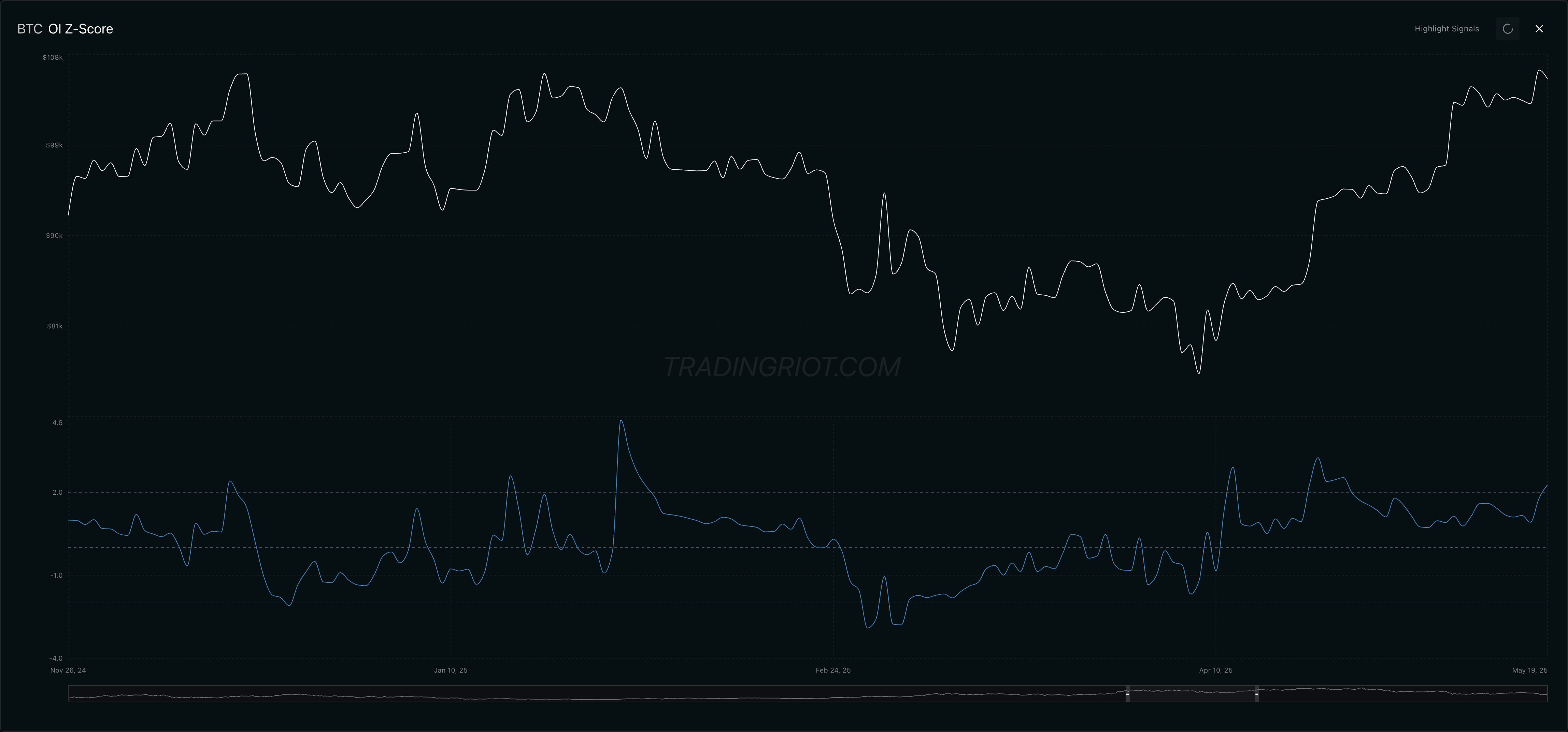
Chart above shows these open interest extremes from last year, while these are not perfect they are clear telling signs of positioning and sentiment. as you can see that technical analysis could have been applied well on both resistance fake out with elevated open interest but also a trend line break into new trend on previously depressed positioning.
In equity options, you can watch put skew extremes at support. Skew shows how much traders are paying for downside protection versus upside. When 25-delta put skew spikes to a statistical extreme just as a name sits on technical support, fear is often maxed out exactly where the chart says it should hold. Stretched protection at support is the options market telling you the crowd is leaning hard one way into a level.
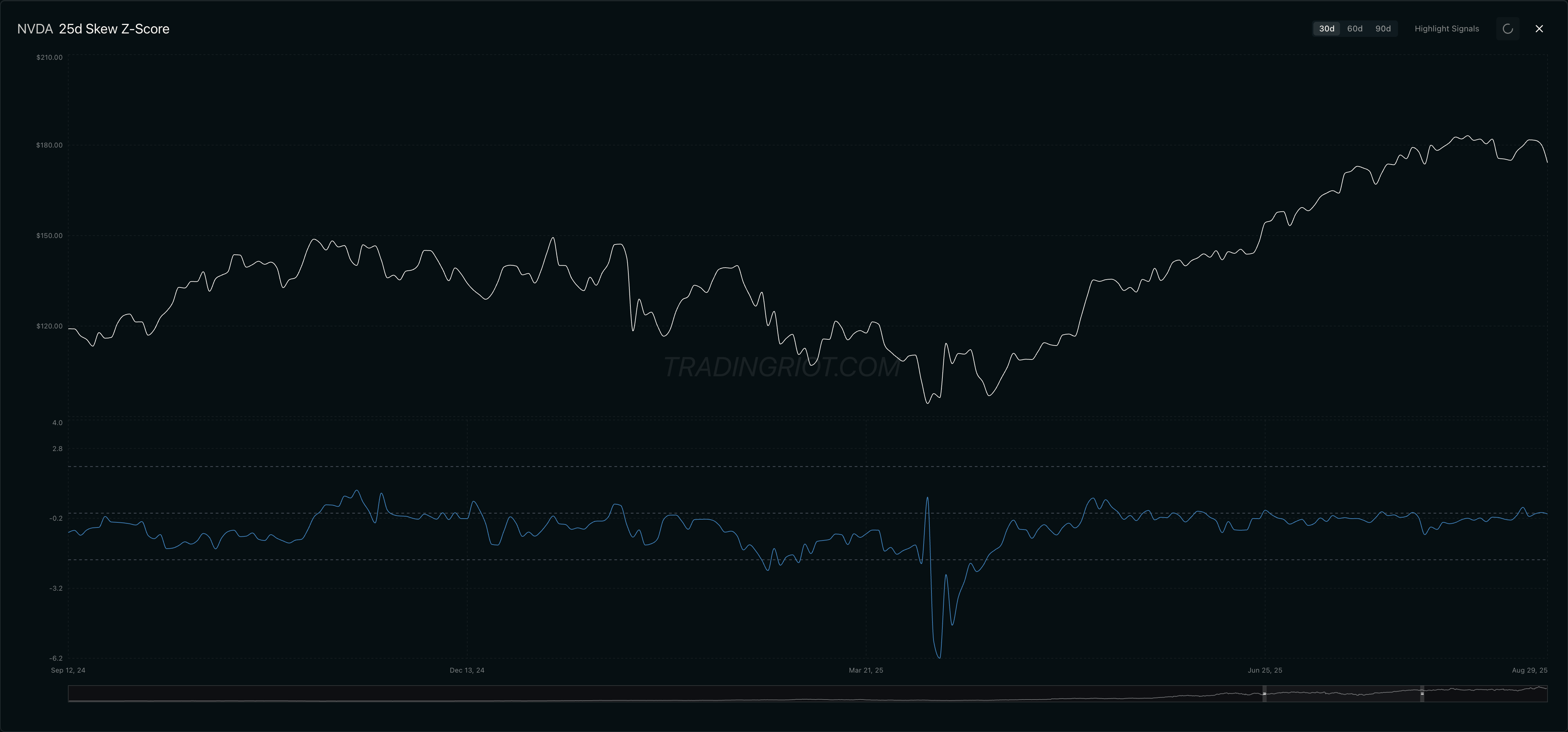
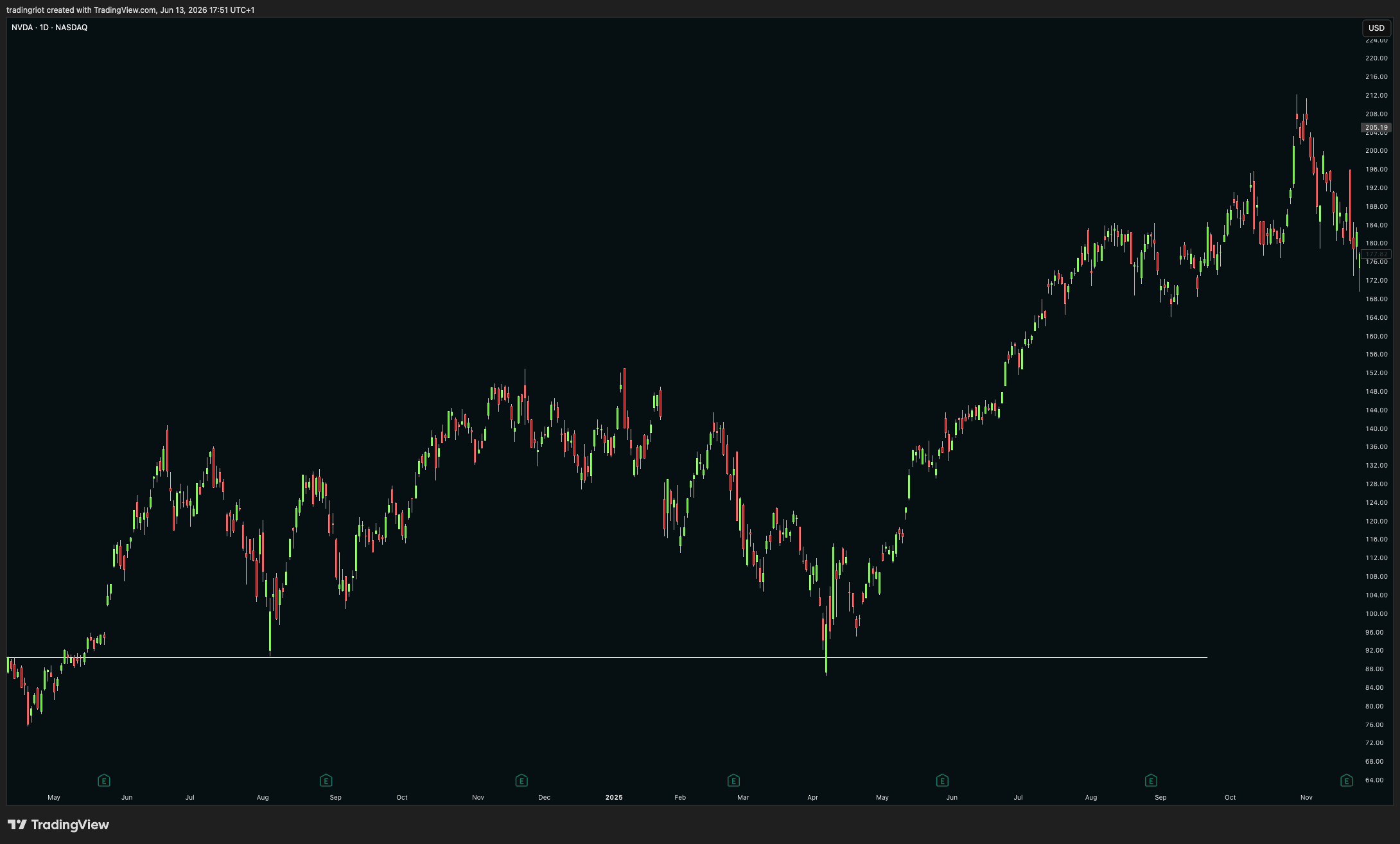
In April 2025, there was a market wide-crash in equities followed by the large rally. The truth is that the skew was showing depressed readings month prior in March already. Even though market resolved higher in the end, you would have been sweating a lot if you bought in March seeing next leg down in early April, but timing this with simple technical analysis concepts would likely make you a more patient and remove lot of the headache as you would have wait for NVDA to test key prior support before taking action.
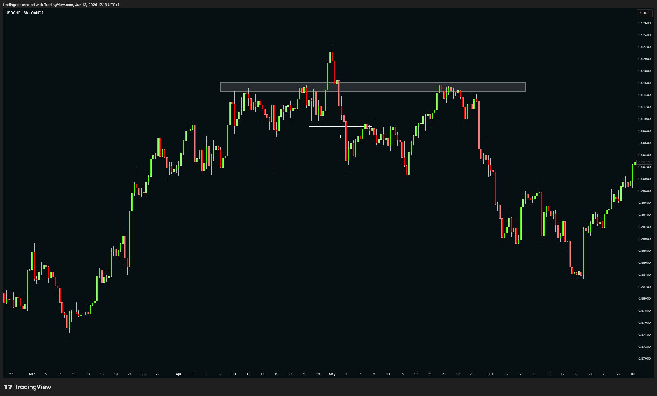
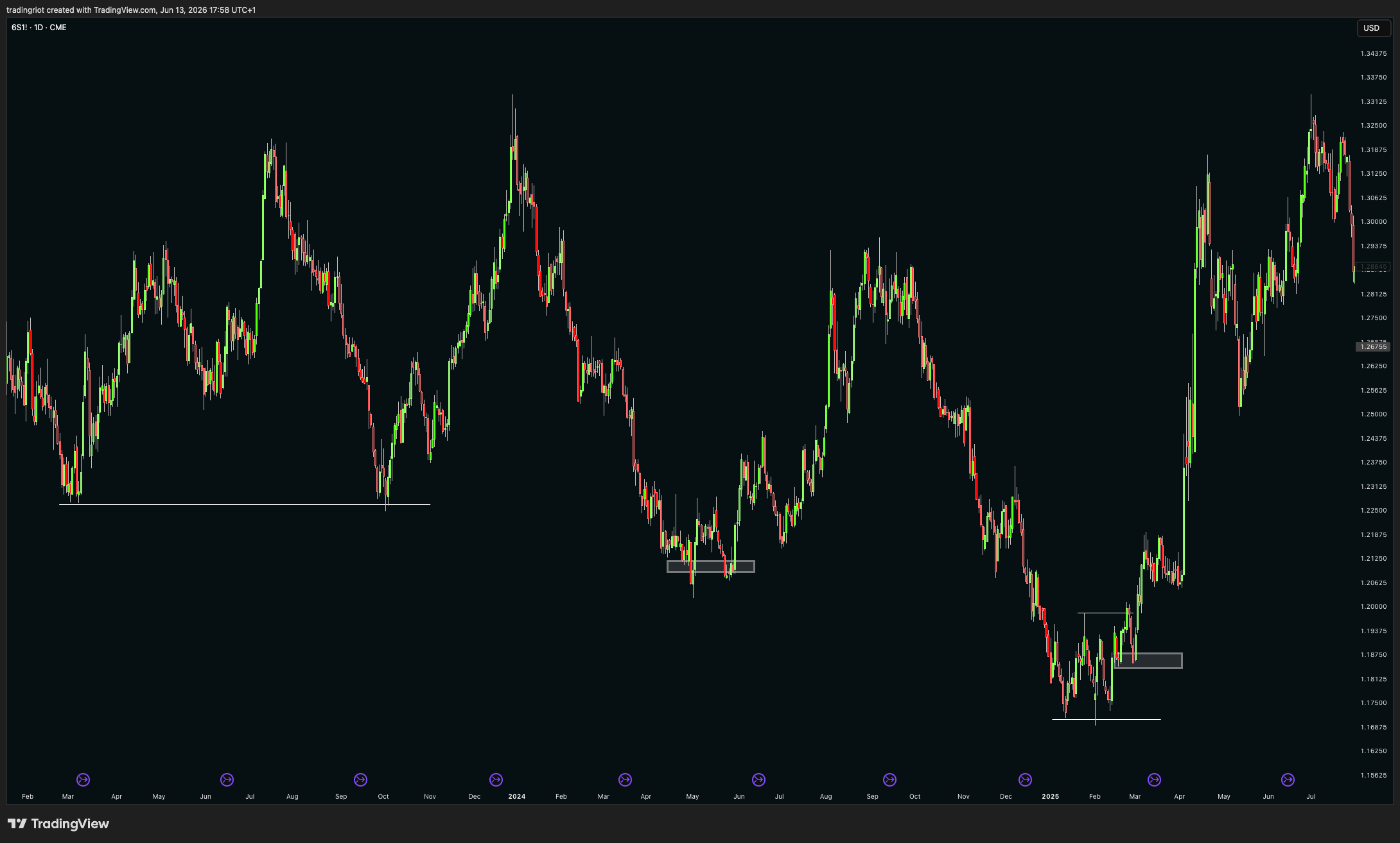
In futures and FX, one thing you can do is watch commercial positioning at support through the COT report. The Commitments of Traders data shows what the commercials, the players closest to the actual asset, are doing. Commercials are hedgers who sit on the other side of the trend while speculators ride it. When commercial positioning hits an extreme in the same area price is finding technical support, you often gets reversals, because positioning from CTAs is too crowded..
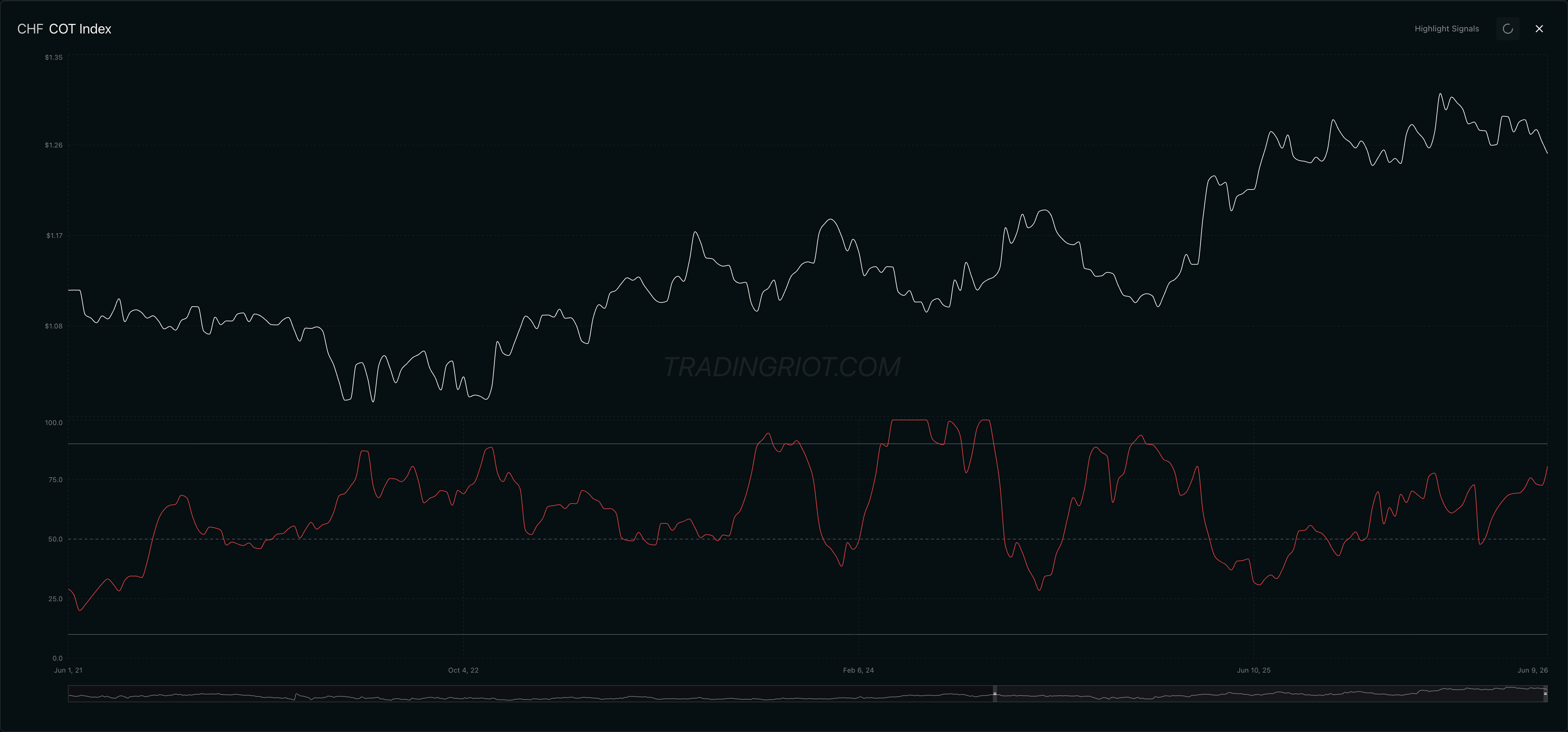
These extremes in COT often take weeks to months to resolve, so technical analysis is again extremely useful here. Looking at futures for Swiss Franc we can see that in three occasions where we saw COT at extremes they were eventually followed by false break of support leading to reversal, over and under pattern and small demand retest after market structure got broken.
Conclusion
Technical analysis works. The research says so, the order-flow data says so, and your own better days probably say so too. It just works for plain, mechanical reasons. Big orders get split and make flow persist. Crowds and trend funds herd over weeks and months and create trends. Watched levels defend themselves. Orders pool at predictable prices, and a cohort of algorithms is firing at the same obvious ones. No secret club required, and anyone selling you one is selling you something you can learn for free.
Keep it simple. Match your tools to the market, trend tools in trends and range tools in ranges. Lean on the handful of price action concepts that carry weight, and ignore the renamed versions sold at a markup.
And never forget the last section. The chart is one layer. It times your trade and sets your risk, but it does not tell you why to be in the trade. That comes from positioning, narratives and fundamentals underneath. Line up a clean technical level with stretched positioning and a turning narrative, and you have an edge. Trade the rectangle on its own, and you have a hobby.
So the next time someone tries to sell you a secret smart money technique, you will know better.